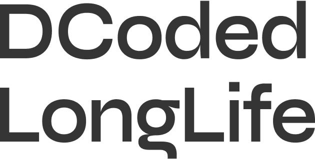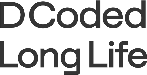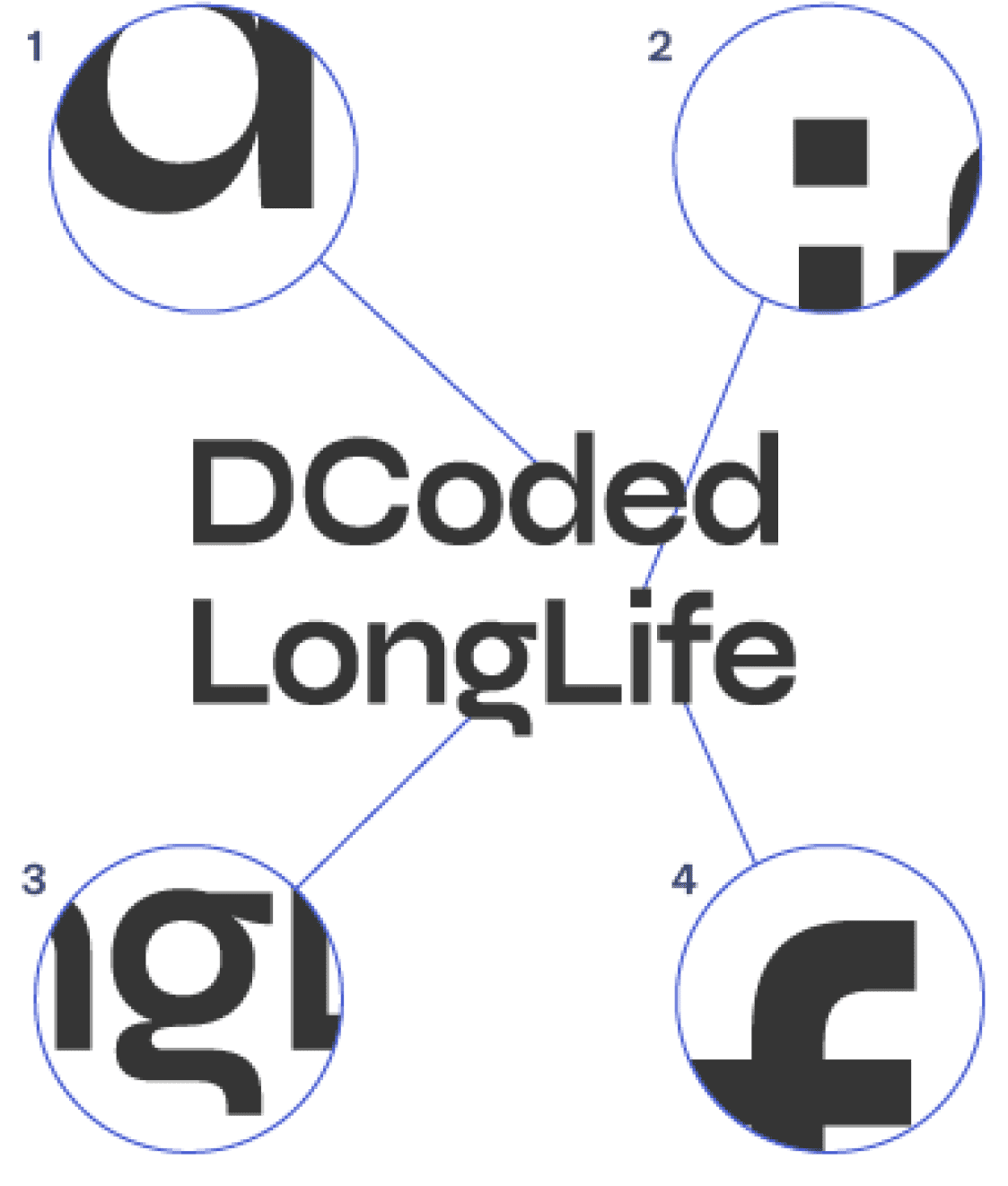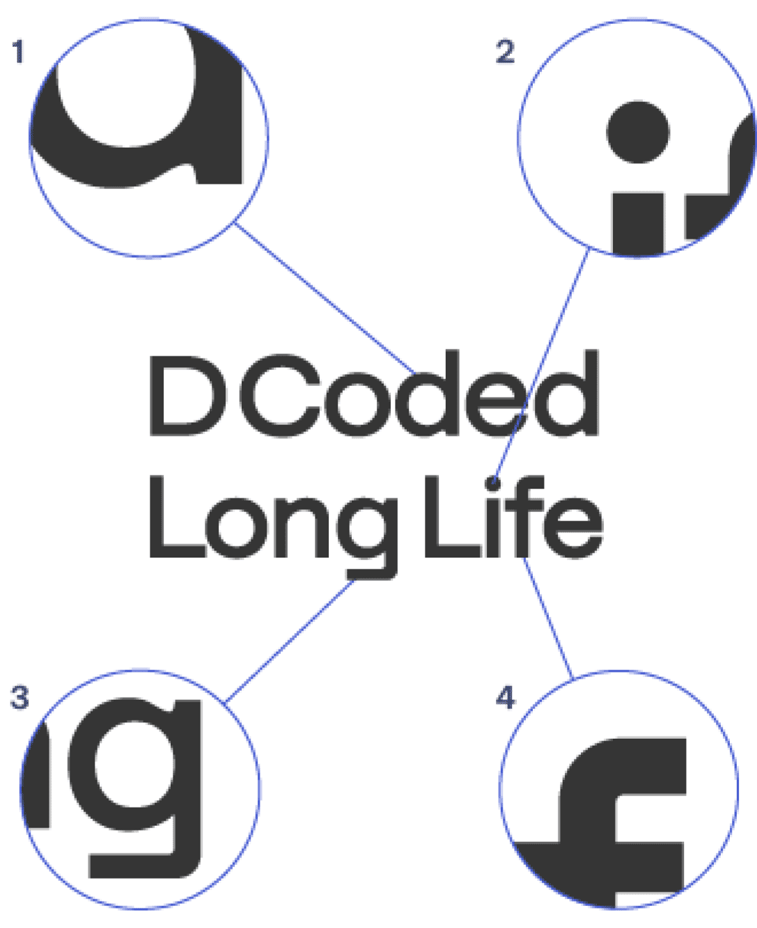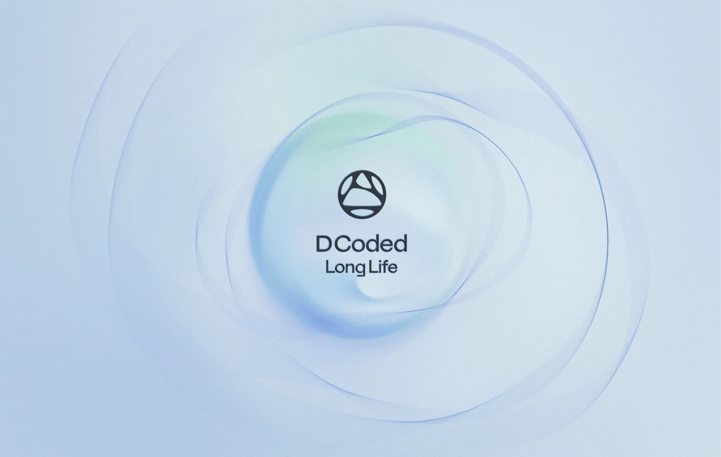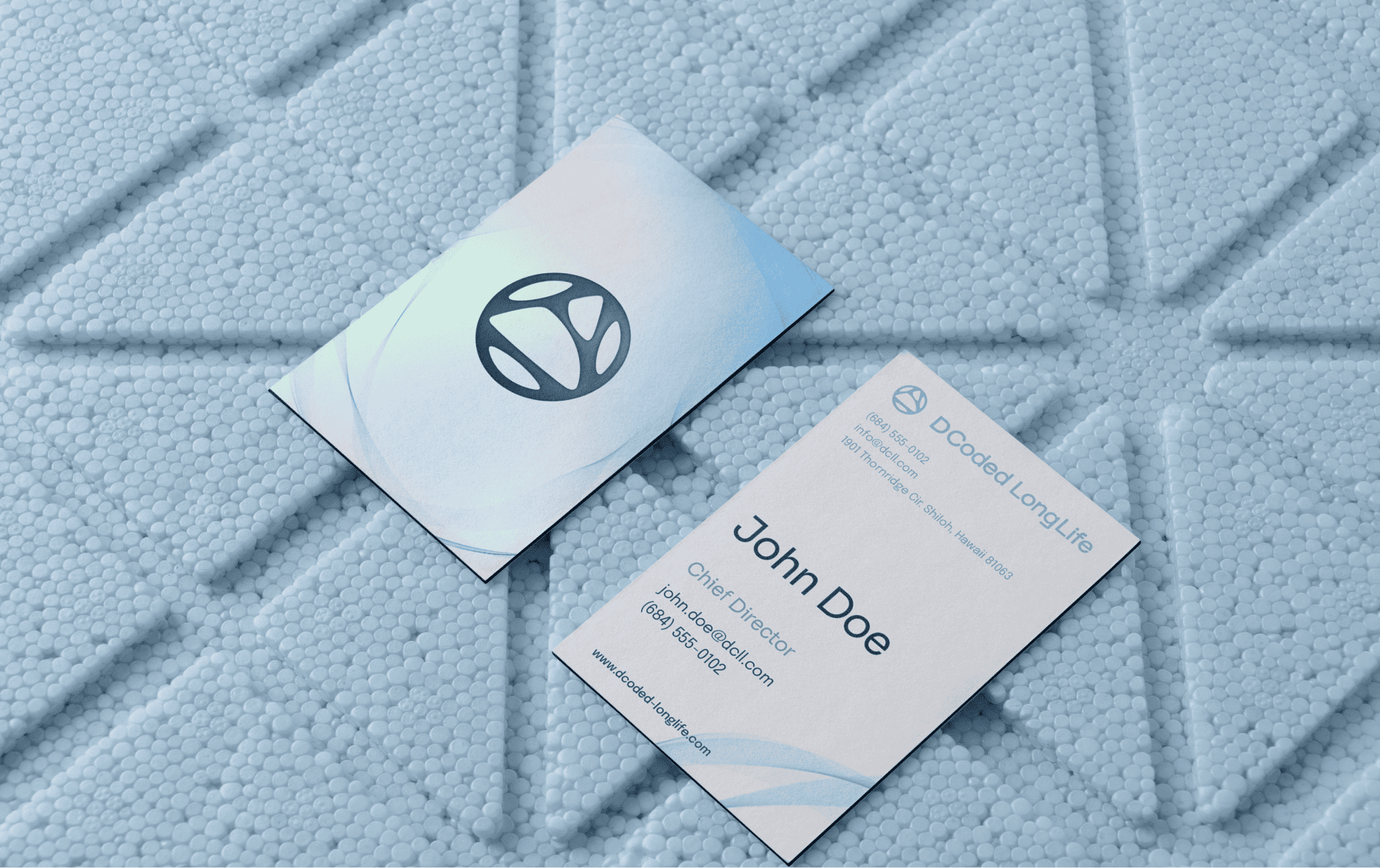
dcoded longlife
4 min read
From diverse ideas to unified design: How I managed multiple stakeholder inputs to achieve clarity and deliver a consistent brand identity
Visual Identity
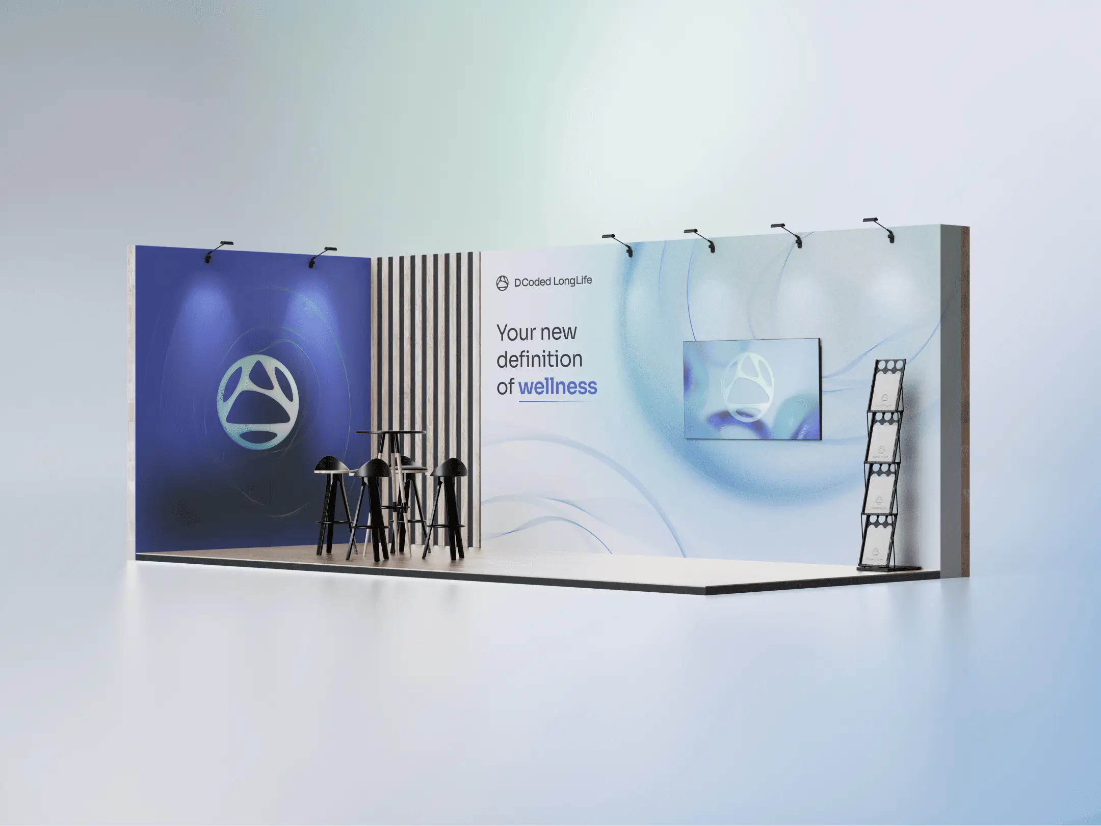
Printables
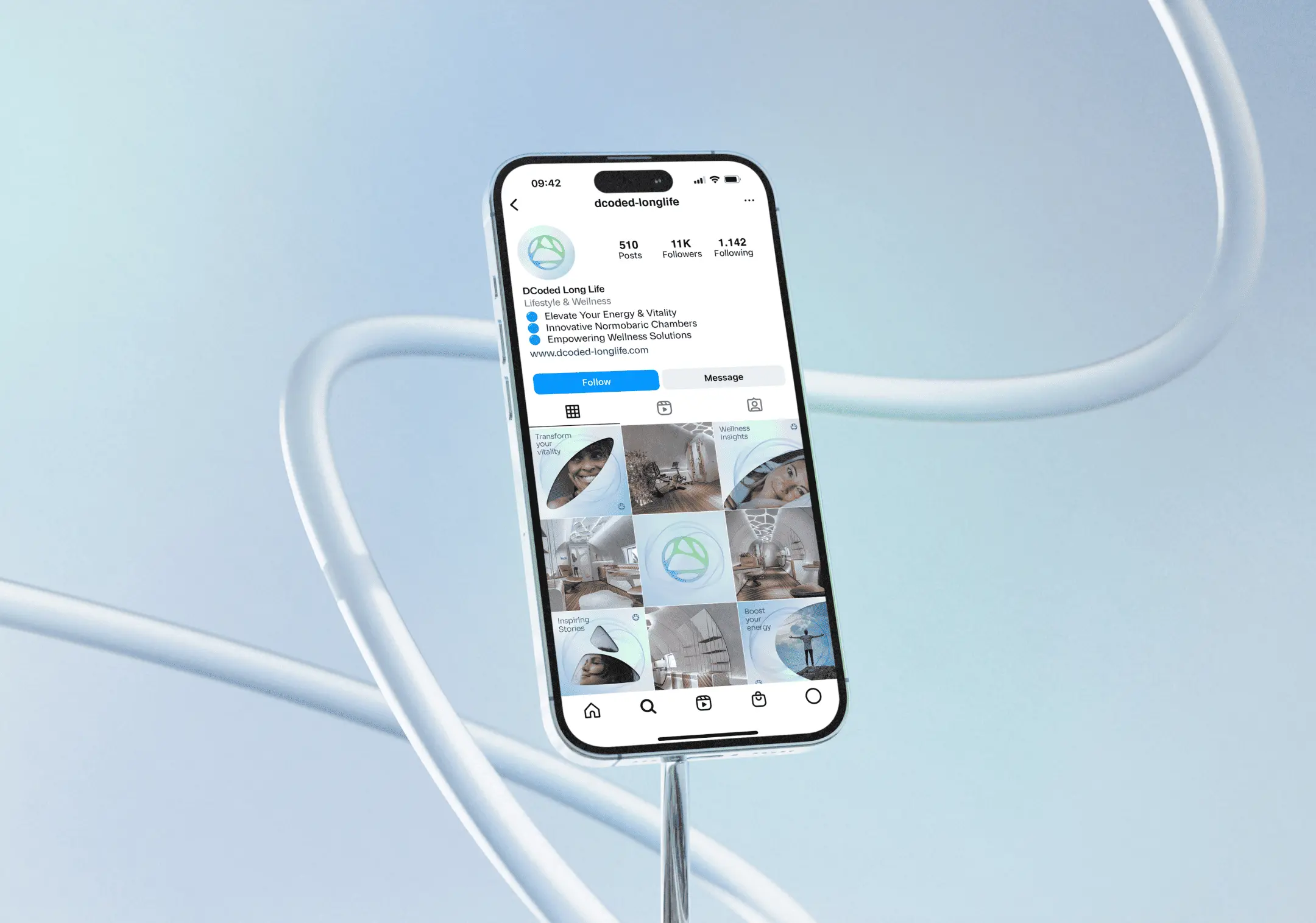
Social Media
Illustration
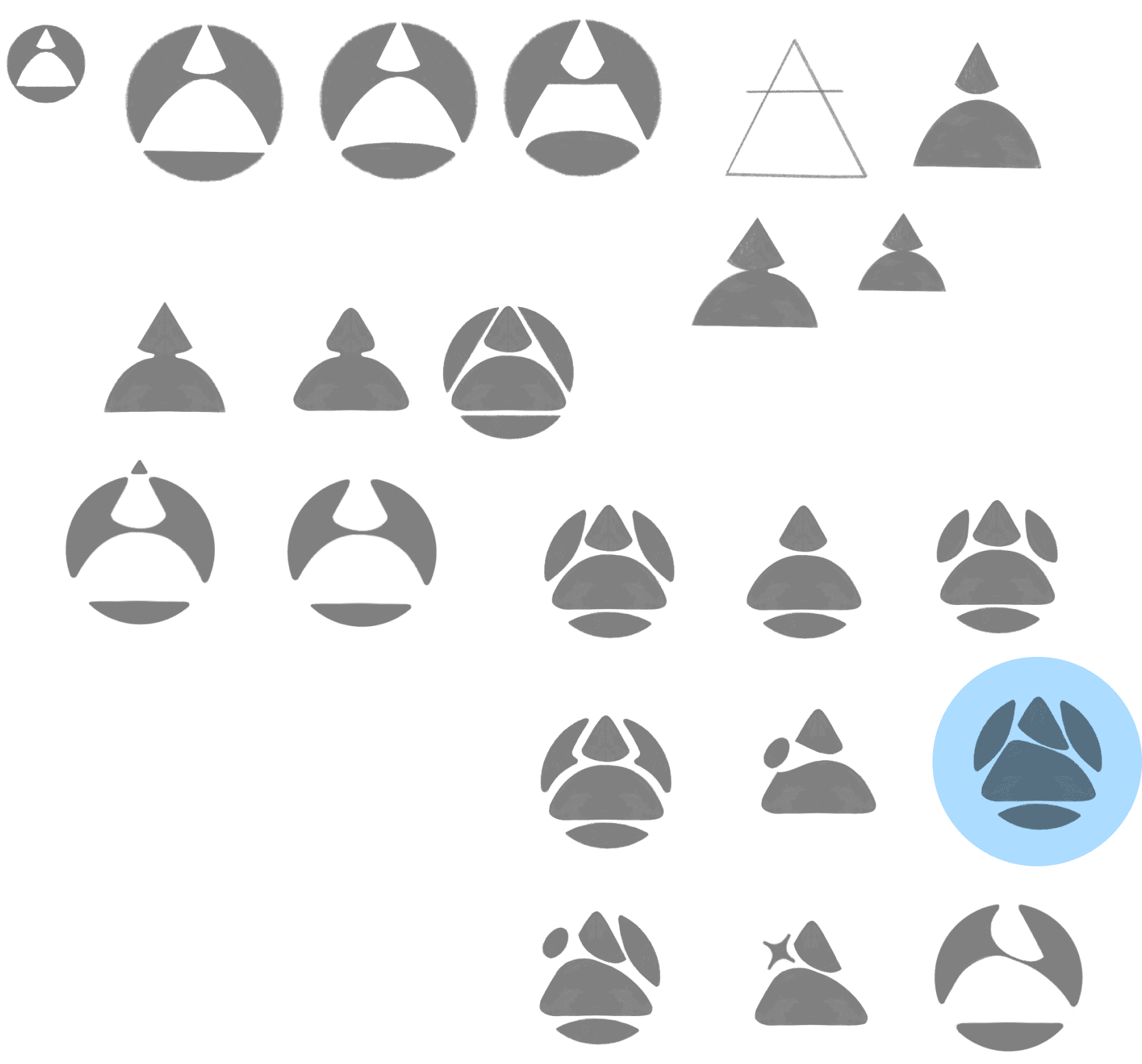
Icon design
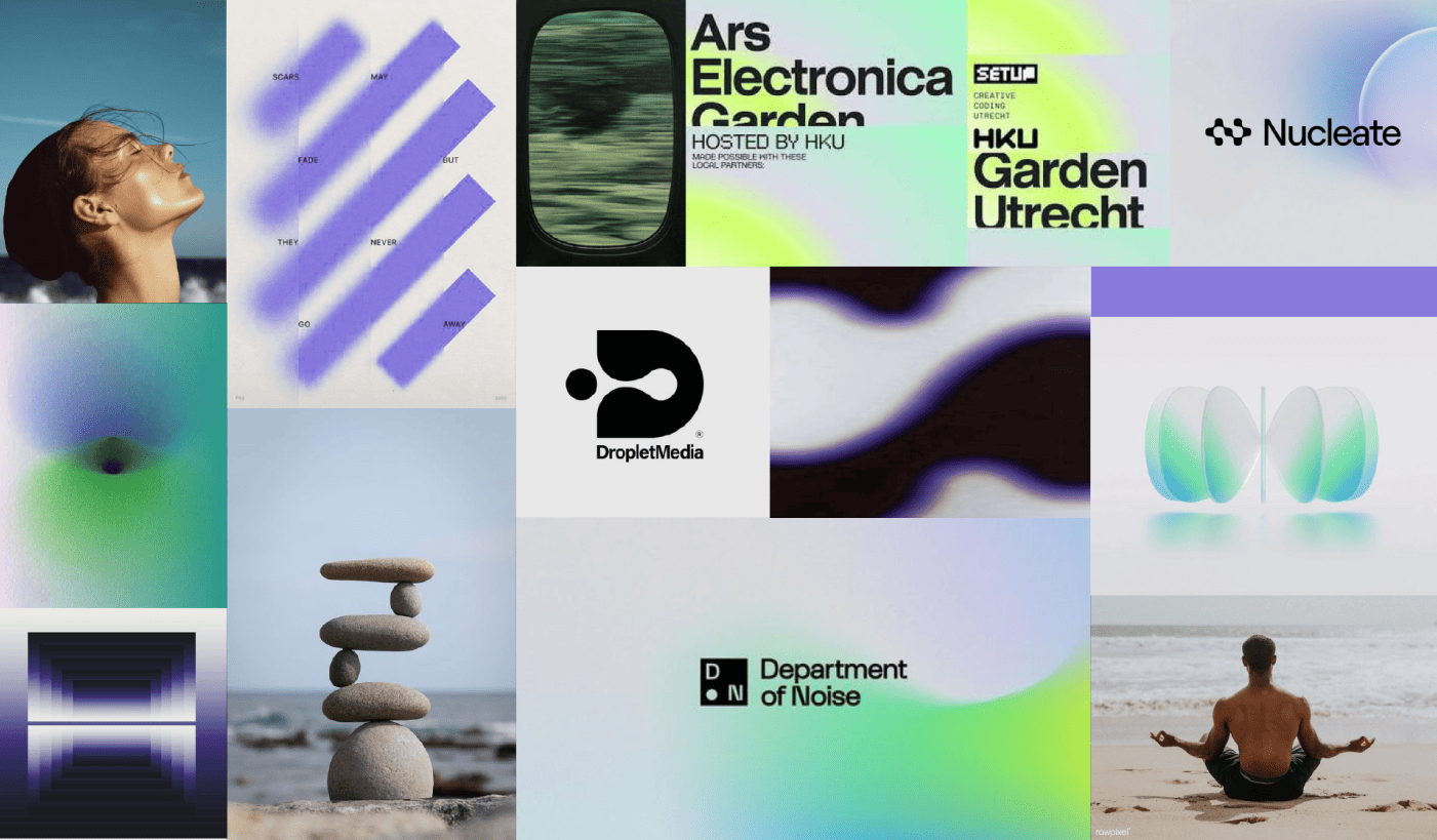
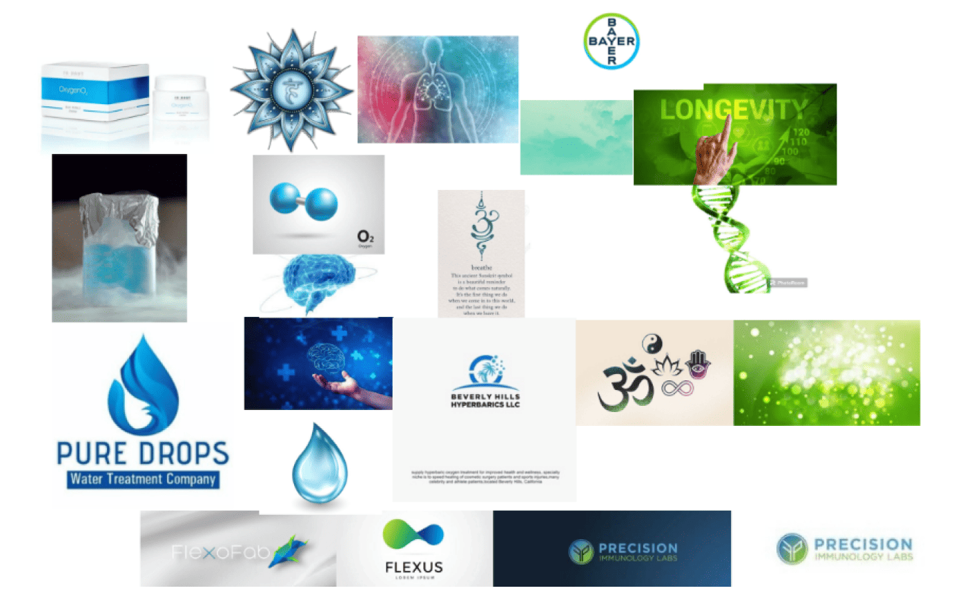
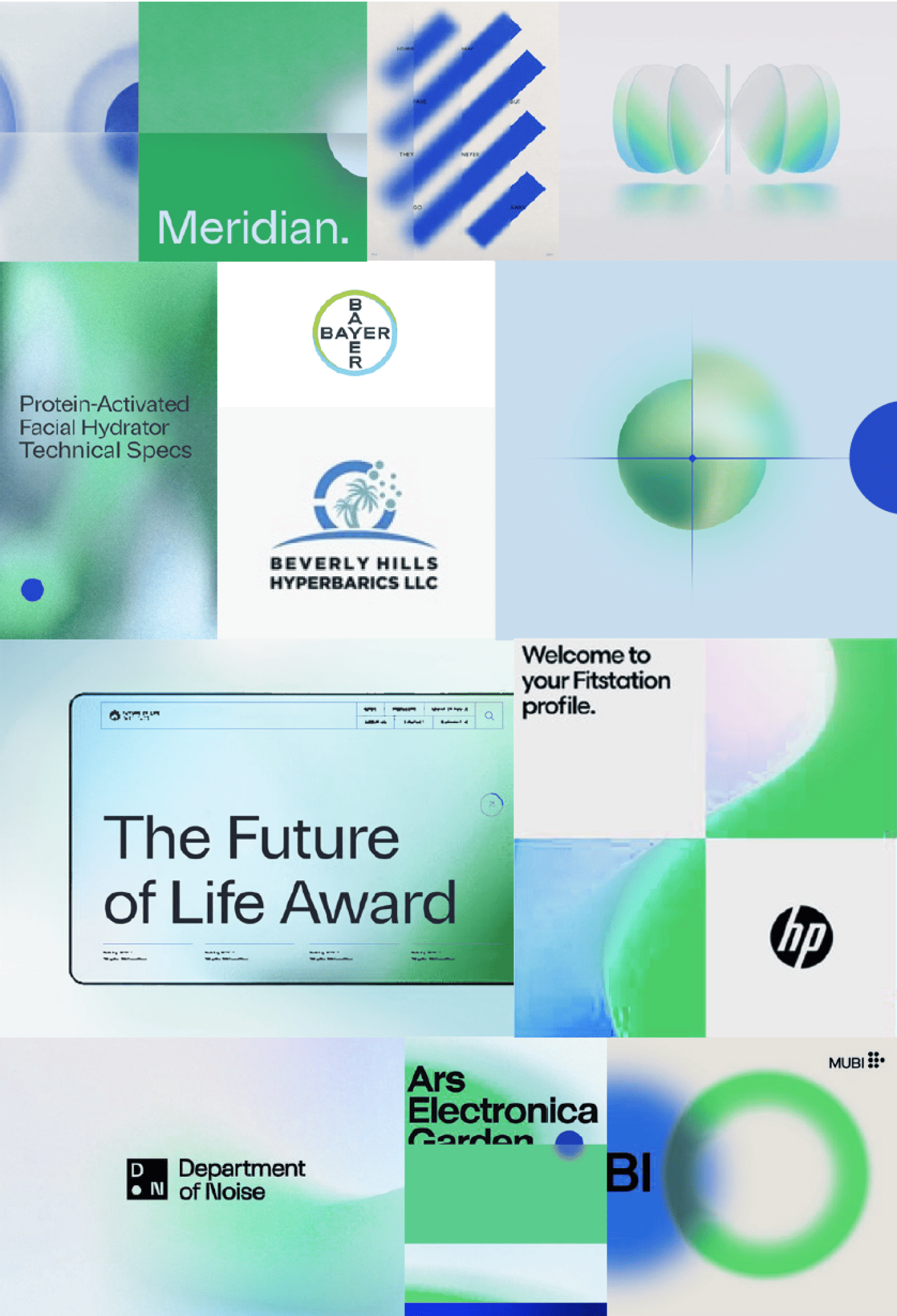
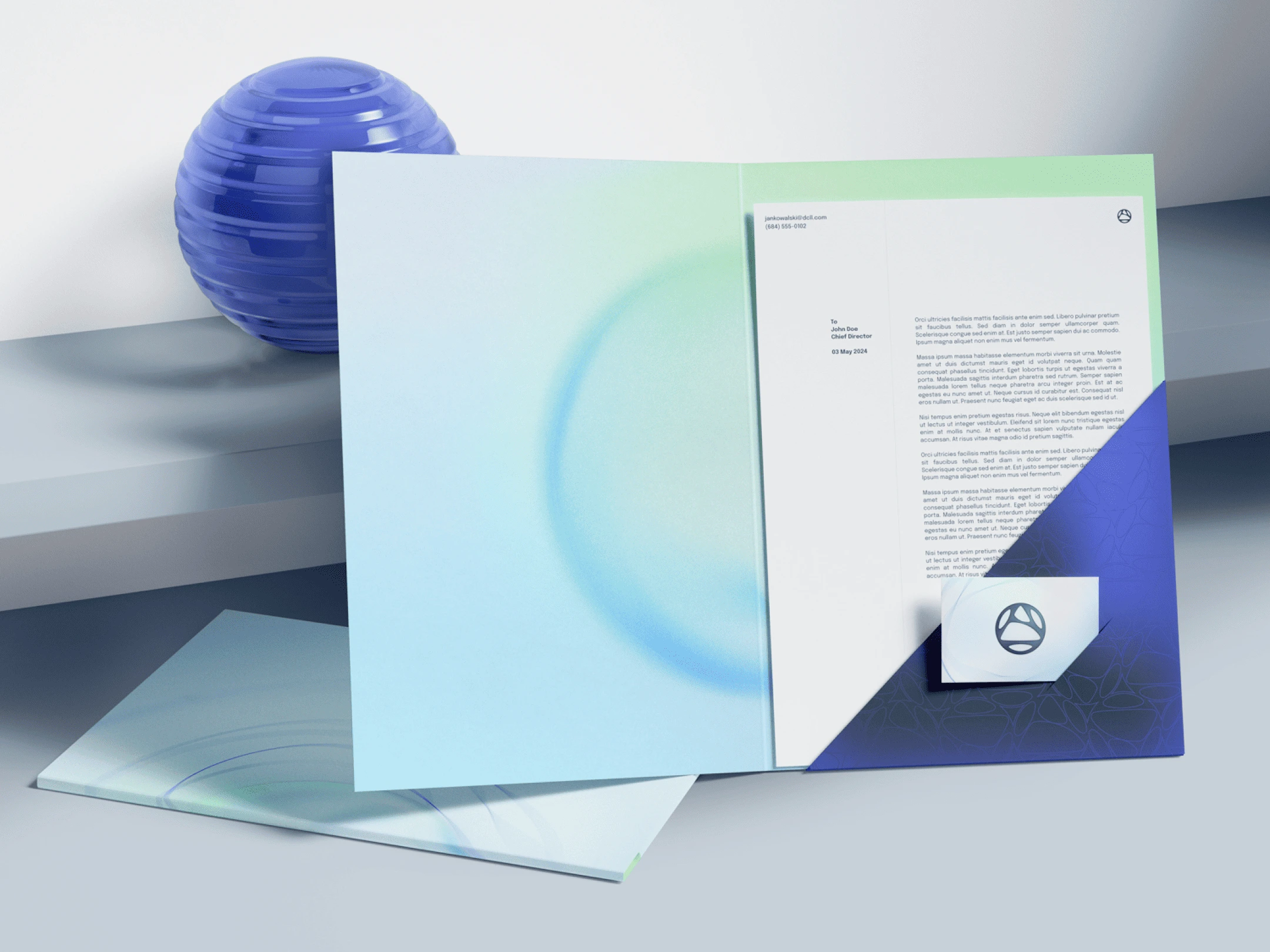
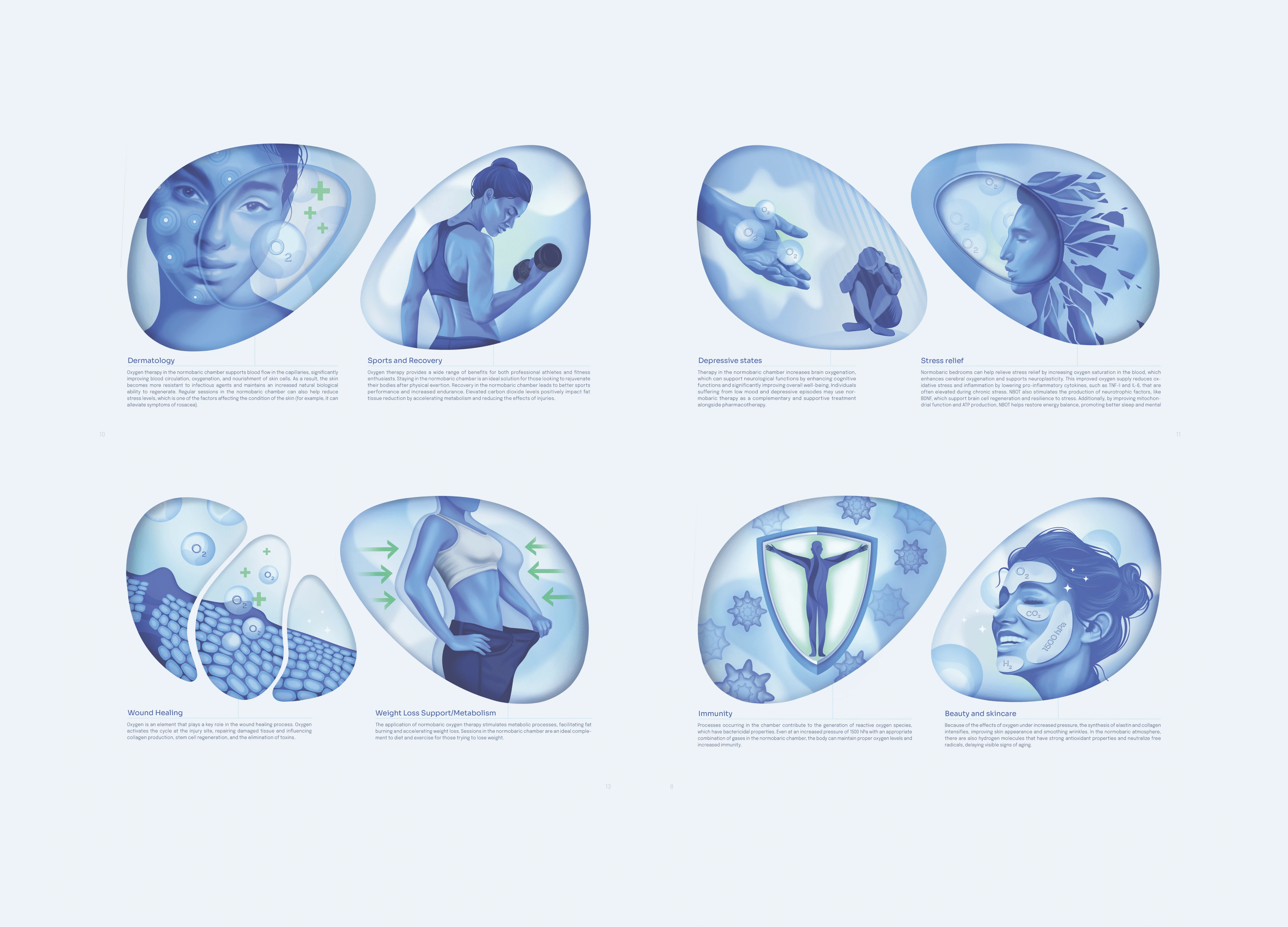
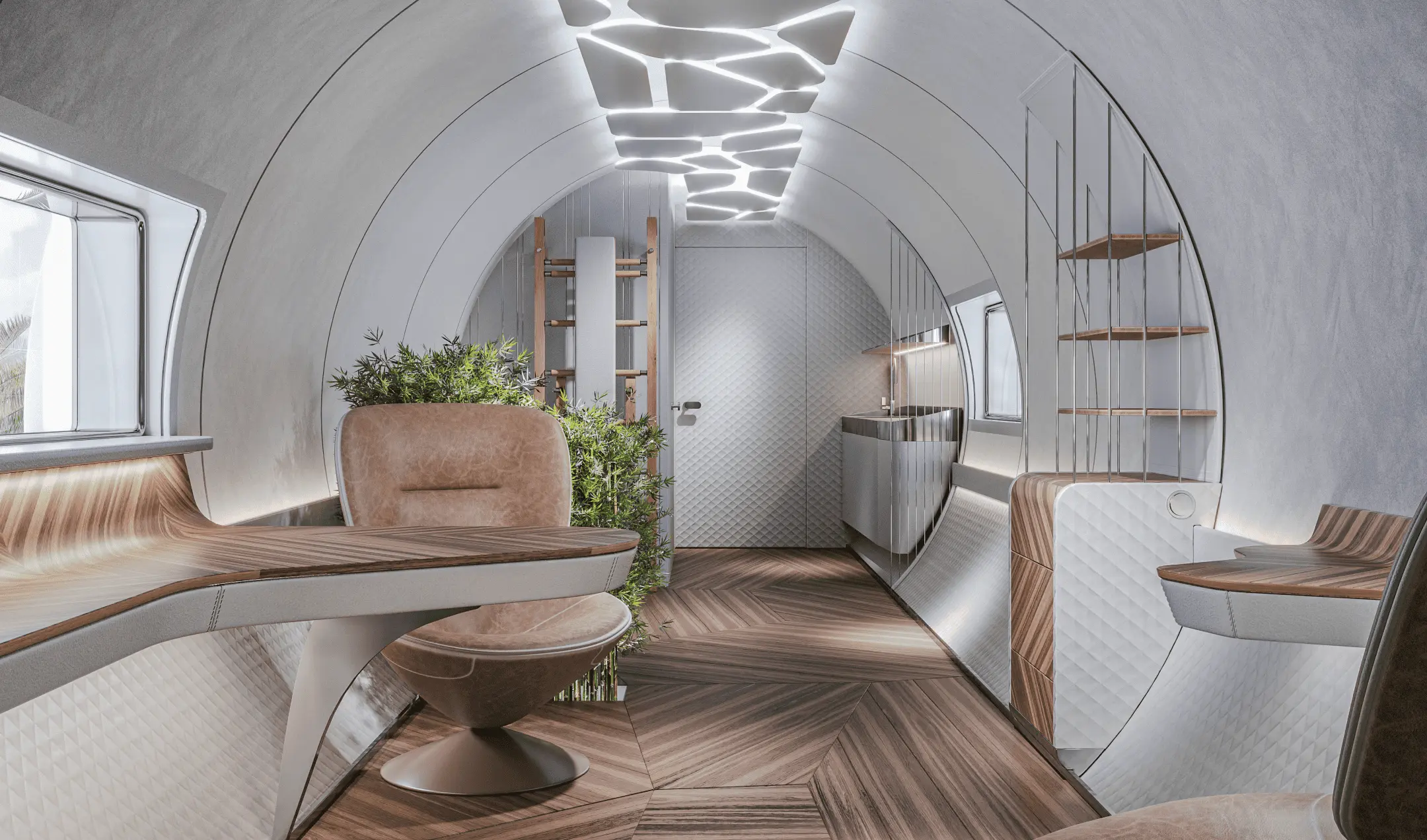
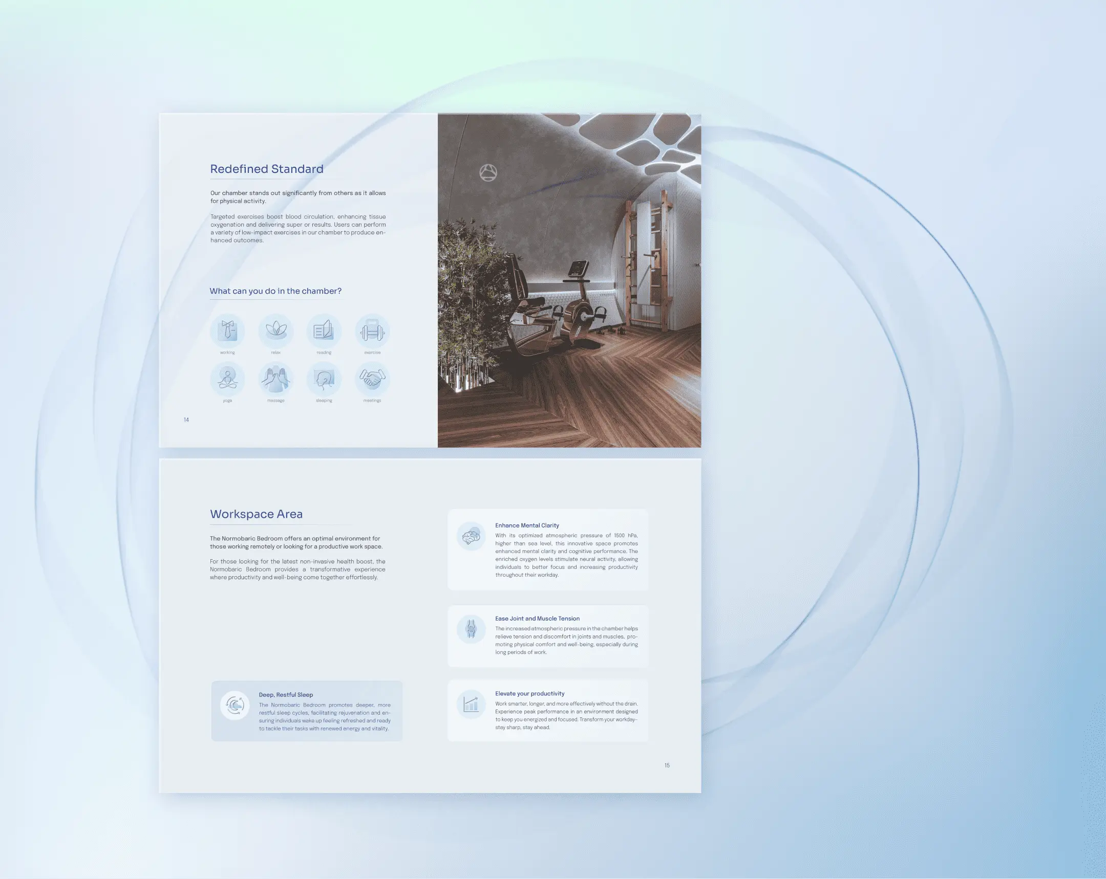
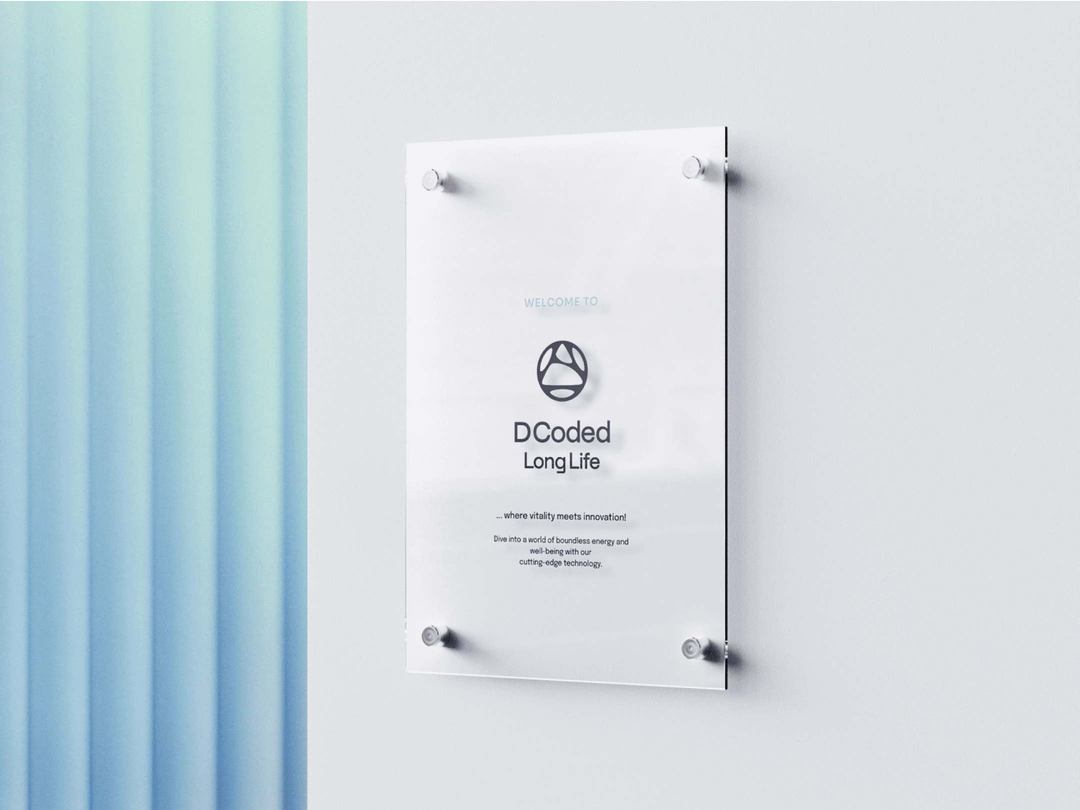
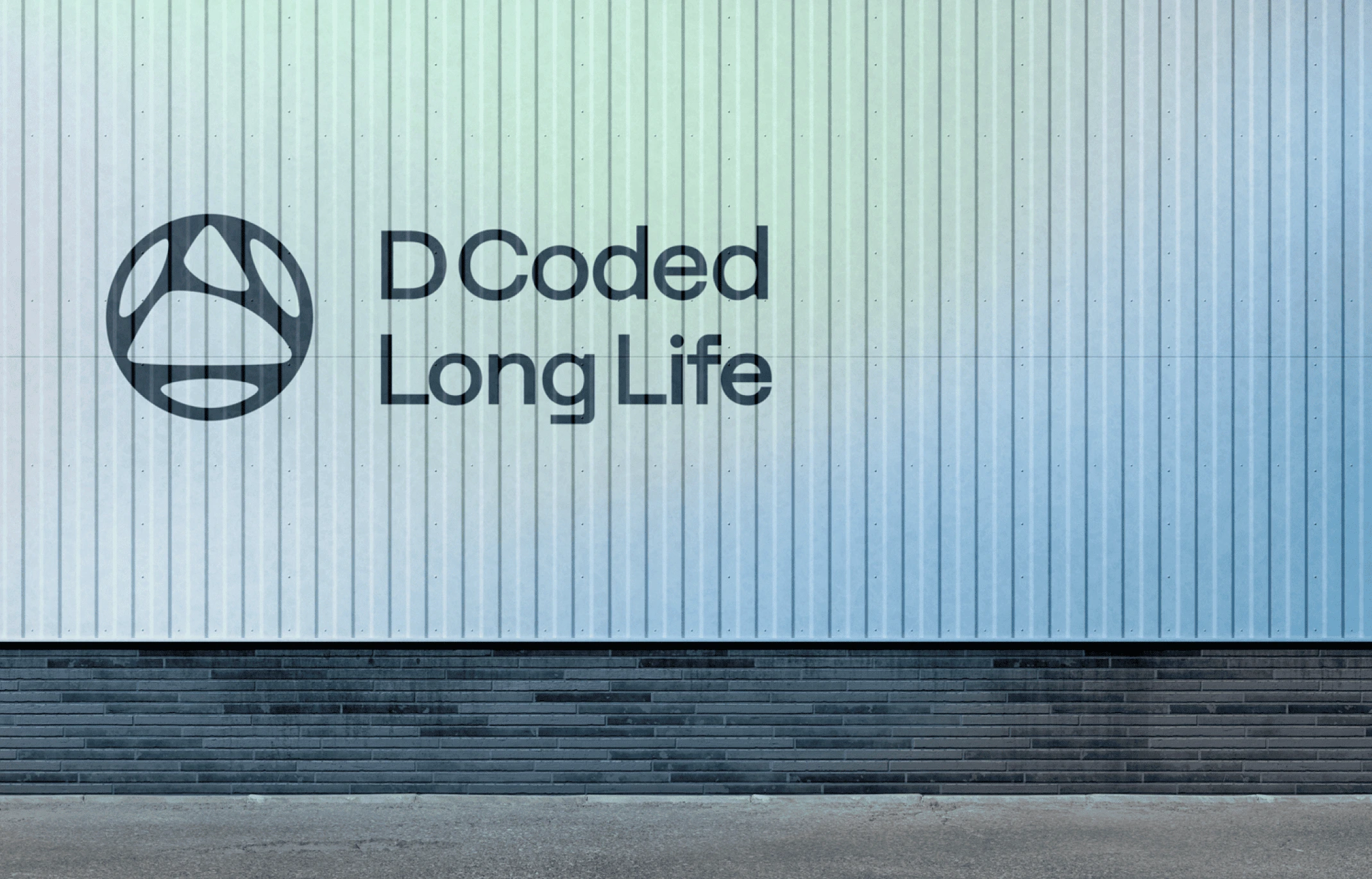
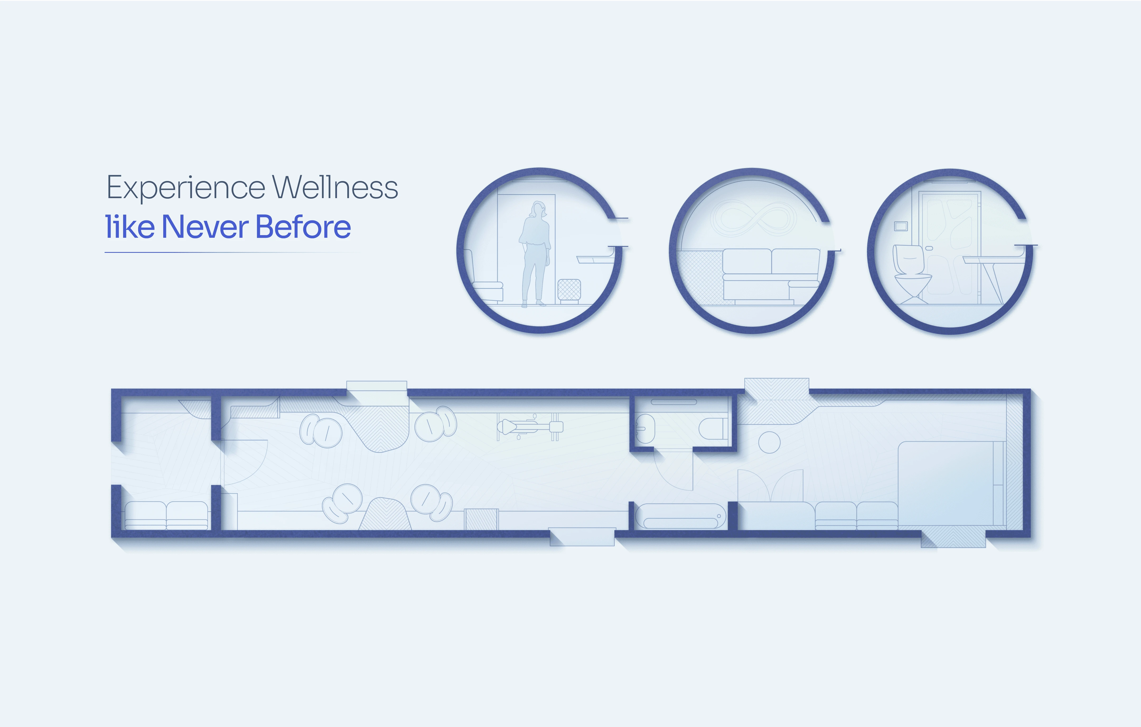
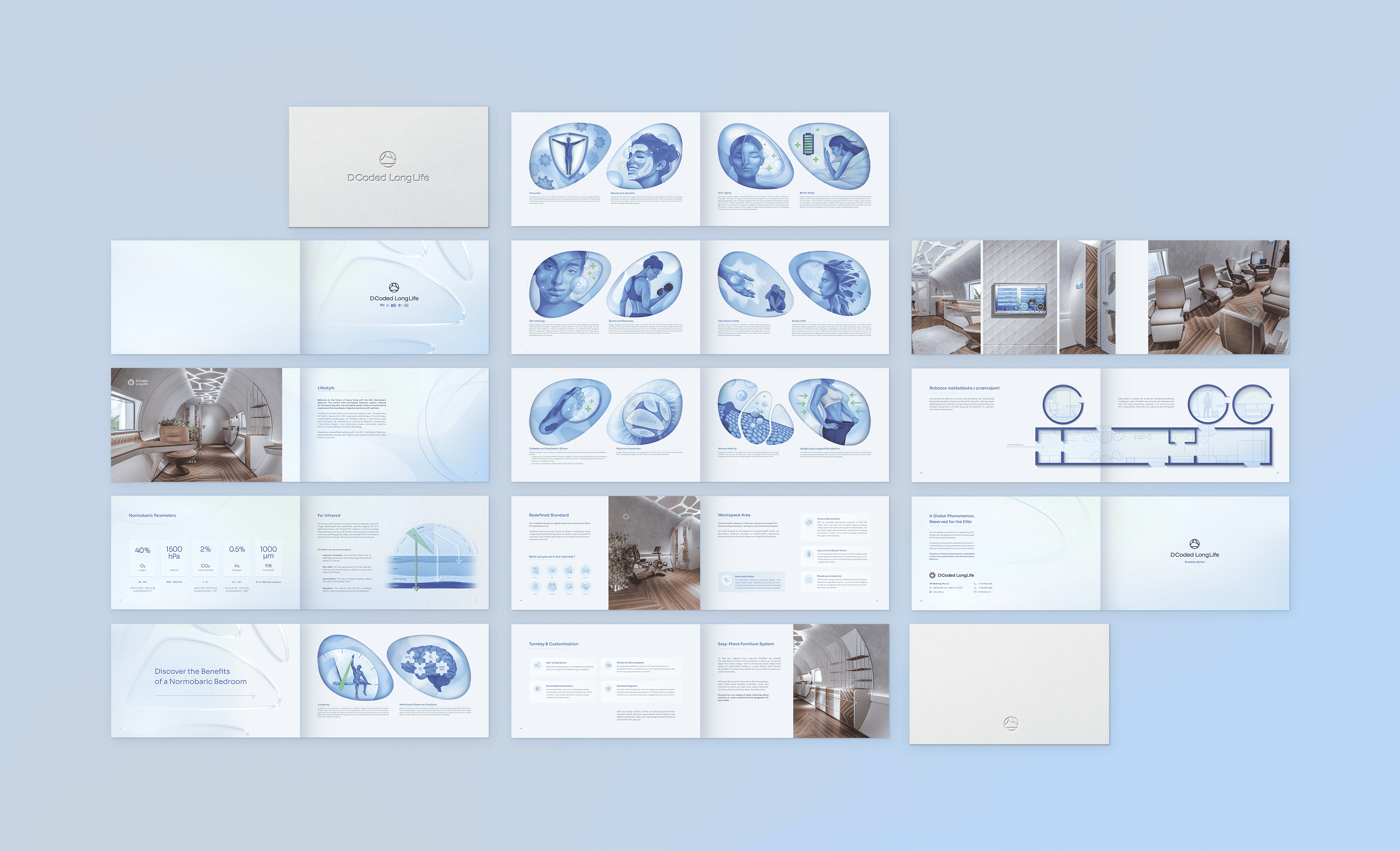
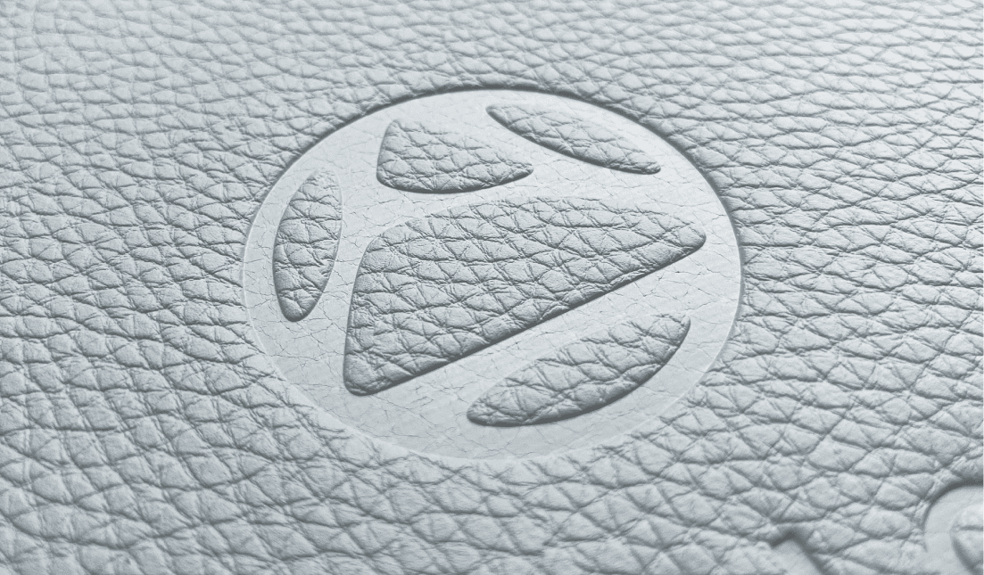
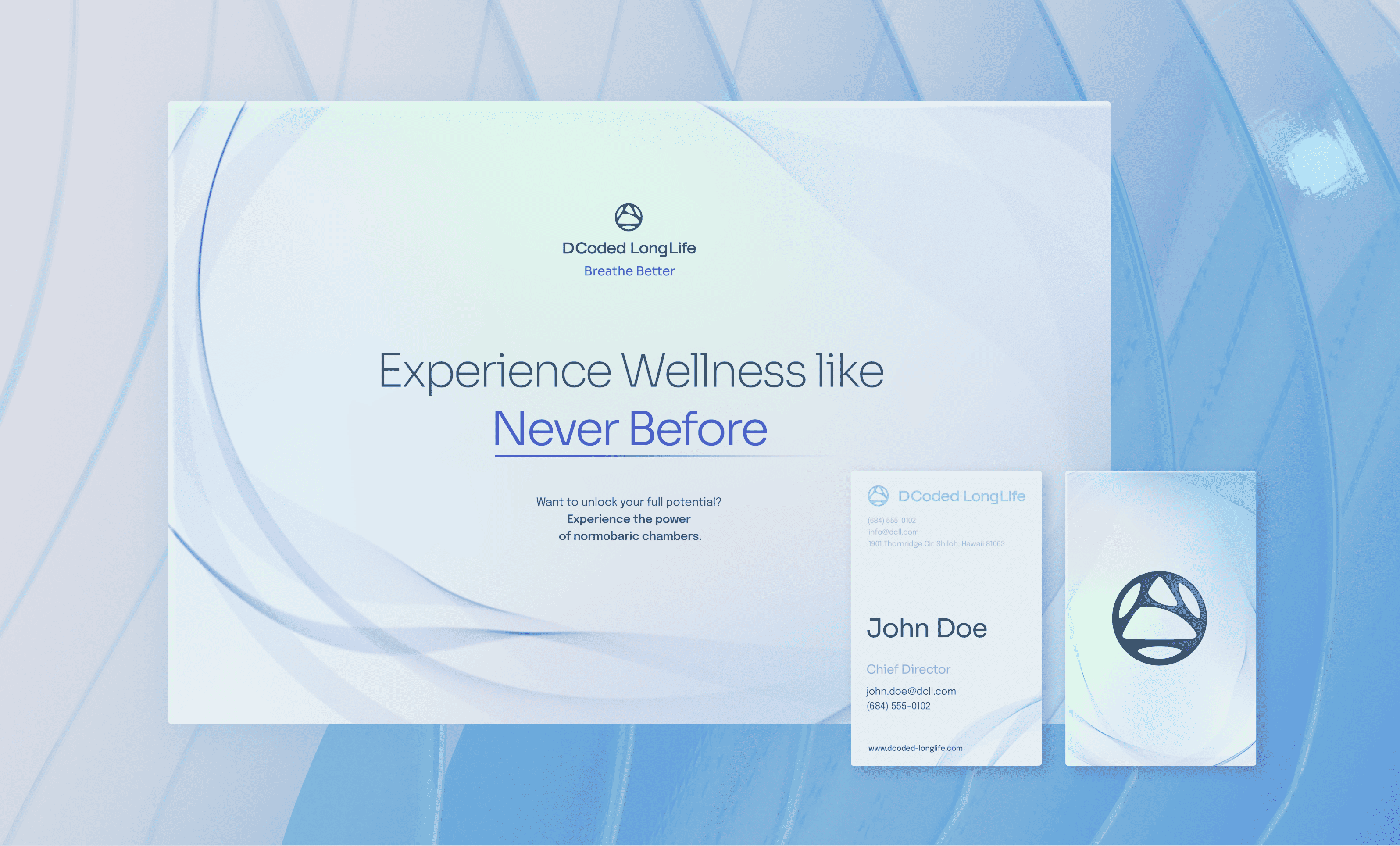
In this project, I was tasked with developing the brand identity for DCoded Long Life, a health and wellness brand focused on normobaric chambers. The challenge was navigating multiple stakeholders' input while staying true to the brand's core message. Each stakeholder brought their own vision, so flexibility and empathy were essential in creating a unified design. By balancing their feedback, refining initial concepts, and sticking to a clear strategy, I was able to deliver a brand identity that met everyone’s expectations without compromising the overall vision.
Managing these dynamics required close attention to detail, a thoughtful approach to feedback, and a clear focus on the brand’s purpose—innovation, care, and regeneration.
Timeline
April - August 2024
Role
Brand Designer
Tools
Photoshop, Illustrator, InDesign, Procreate
Client
DCoded LongLife